Oil Painting 101 - Choosing Paint
This ART-Tickle will cover how to go about buying supplies to begin painting in oils. First of all, we will deal with the paint. Oil paints come in various name brands, prices, and qualities. I want to talk just a moment about paint quality. All paint brands use the same pigments to make their colors. Most companies offer two grades of oil paint; Professional and Student Grade. Both use the same pigments, and both use linseed (or other) oil as the "vehicle". The main difference is that student grade paints will have less pigment, and the space difference is usually taken up by adding marble dust (calcium carbonate). Throughout history, the only expensive part of making oil paints have been the pigments. Pigment varies greatly in price, depending on it's availability, and on it's "preciousness". Cobalt, Cadmium, and other heavy metals will be by far the most expensive. Earth colors, basically made from dirt from various parts of the world, will be the least expensive of colors. All the top professional grades of paint now include colors made from synthetic pigments, often called 'hues.' When these were first introduced, they were viewed with suspicion, but over the years, the synthetic or man-made pigments have proven to be very acceptable and most importantly, are much less expensive than the mined pigments they mimic.
All that being said, you need to decide which paint you want to use by comparing price and pigment load. Professional grade paints usually have very similar pigment loads, and mainly vary in their method of milling. Pigment and oil is mixed together (Milled) using rollers either made of metal or stone. Professional paint may be milled once or multiple times. Triple milled paint will obviously be smoother and more "buttery" than paint milled less. Some paint makers go so far as to double mill the paint, then let it sit on a shelf for months to let it "rest", then mill it again. The milling process is one large factor that goes into pricing paint. Many people balk at the higher price of professional paint, but it actually takes less professional grade paint to do a painting because the coverage is so much better. Mixing paints will also reveal the "truth" because with a student grade paint it will take FAR more paint to change another color, where only a small dab of pro paint will influence another color. Sometimes, trying to mix student grade paints will create a mountain of paint because you have to keep adding and adding more paint to change the color. I advise you to try both and see which you prefer. Also, try several brands and see which of those you prefer. Many artists, including me, have preferences in color from brand to brand, preferring certain colors by different makers. It is perfectly OK to mix brands of oil paint. (Water Mixable Oils may also be mixed up to a point, but that matter will be saved for another article; let's stick to traditional oil paint here) I will go on record here and say that my favorite brand of oil paint, hands down, is Gamblin Professional Oils. They offer a buttery consistency, as well as beautiful, extremely vibrant colors. That being said, I have nearly every professional brand of paint represented in my paint box! Talk with your art supply provider about which paint may be right for you and your budget.
Once you decide on the brand (or brands) you want to try, you will need to know which colors to purchase. I am going to give you a standard palette of colors that will get you started. Colors come in various "temperatures", either warm or cool. Warm colors such as red and yellow and orange may also lean one way or another on the temperature scale. The same is true of cool colors such as Blue, Green, and Violet. For instance, Ultramarine blue is cool because it's blue, but leans toward the warm end of the cool scale. Certain pigments also dictate whether a color is transparent, semi transparent, semi opaque, or opaque. Metal pigments usually are opaque, while earth colors can be transparent. For our basic purposes we will want a warm and cool variety of each of the three primary colors, Red, Blue, and Yellow. Here is a good, basic palette selection:
Cadmium Yellow Light- warm, opaque.
Yellow Ochre- cool, semi transparent
Ultramarine Blue- warm, semi opaque
Pthalo blue- cool, transparent, very intense
Alizarin Crimson Permanent- cool red, transparent (Alizarin Crimson PR83 is not light fast. Choose instead PR177 or PR122. They may come in other names than Aliz. Crimson Permanent. Instead, look for the pigment #)
Cadmium Red Light- warm, opaque
Titanium White- opaque, strong
Ivory or Chromatic Black- transparent
You can work with this palette selection perfectly well, and add no other colors. But, to make mixing colors easier we could add a few other secondary colors. I like adding a green or two, and a deep orange.
Burnt Sienna- deep orange, great for mixing and flesh tones.
- Also makes a warm black when mixed with Ultramarine Blue.
- Makes a beautiful, cool "black" when mixed equal parts with Alizarin Crimson Permanent.
- Also great mixed with Alizarin Crimson Permanent.
There are numerous colors out there for sale, and you will ultimately have to decide which colors you like. You may be like me and simply like to "collect" colors. I am a color hog! I vary my palette to suit my mood, or to challenge myself, or to create a certain look in a painting. I like having lots of colors so that I have those options. But you can create any color under the rainbow with the color palette I have suggested for you.
Color Names Versus Paint Tube Names
Another way to choose your palette is to use the 12 colors on the Color Wheel rather than using paint tube names, and chose the best color that matches YOUR vision of that color.
The colors are as follows.
|
Yellow
Yellow Orange Orange Orange Red Red Red Violet Violet Blue/Violet Blue Blue Green Green and Yellow Green |
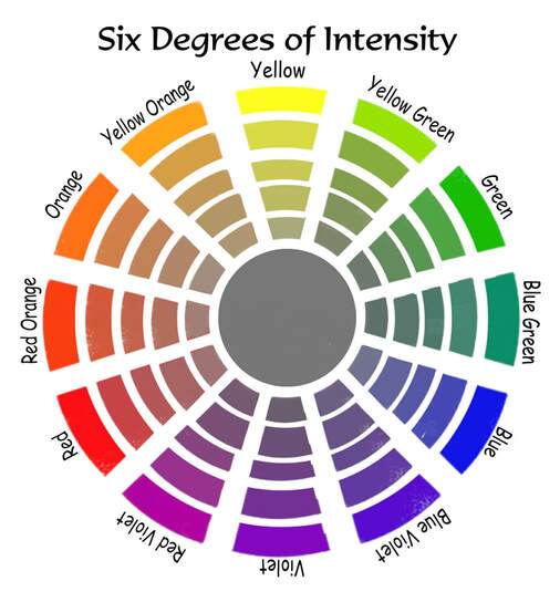
|
Adding Black and White, then choosing this color palette, will make color mixing infinitely easier, but it's a lot of colors!