Color Mixing and Color Space:
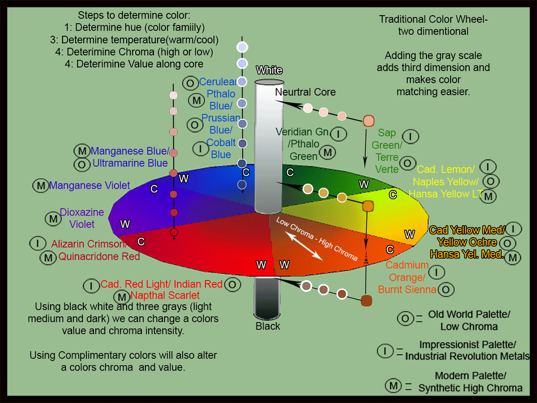
How does one go about mixing colors? Where do you begin? This little art-tickle hopefully will help you realize where to start and what to mix to achieve any color mixture. We are all familiar with the traditional "Color Wheel" of Yellow, Orange, Red, Violet, Blue, and Green. Is that all there is? I have always thought not, but wasn't sure what needed to be added. I came across Robert Gamblin's video on Color Space and knew I had found my answer. Think of the color wheel in three dimensions, with the flat of the normal color wheel in the center and a core of neutral grays protruding above and below the center. See the illustration below:
There is a lot of information there but don't let it confuse you. I'll try and break it down for you here.
... Back to the color wheel for a moment. The wheel is broken down into six sections, Yellow, Orange, Red, Violet, Blue and Green. Each of those sections is known as the color family, or Hue. At the outer edge of the circle is the highest chroma area, or the area with the brightest, most intense colors. Near the center of the wheel is the neutral core or the area with the lowest Chroma colors. Knowing a colors "Chroma" is important in knowing what to mix to achieve your color. Complimentary colors can be added to a color to lower it's chroma. Anytime two colors are mixed their chroma is lowered. Complimentary colors are the colors located on the opposite side of the wheel from any color. Red's complimentary is Green. Blue's is Orange, and so forth. Adding a complimentary color will shift any color toward the neutral core.
The two-dimensional color wheel pretty much deals in Hue and Chroma only. But what about Value? It's not there, right? As a color gets "lighter" it's value is considered "higher". As it gets "darker" it's value is "lower". Notice the core going through the center of the wheel. White is at the top (higher value) and black is at the bottom (lower value). In between is a myriad of grays. Let's break those down into three values of gray; light, medium, and dark. Medium gray is located where the wheel meets the core. Light gray is midway between there and white, and dark is midway between there and black. Those grays plus black and white will be important when mixing our colors. More on how to use gray for color mixing in a moment.
Temperature: Each color family has an inherent temperature. Yellow, Orange and Red are considered WARM. Violet, Blue and Green are considered Cool. (Think of Red Hot Fire and Cool Blue Water). However, within those color families each hue has an individual temperature "Tendency". Notice around the edge of the wheel, there are "W"s and "C"s representing cool and warm. The Yellow wedge is cooler toward the green side and warmer toward the orange side. Blue is cooler toward the green or yellow side and warmer toward the violet or red side. Two warms meet at Orange and Red, and two cools meet at Blue and Green. These are known as the Hot Spot and Cold Spot. Learning a colors temperature can go a long way in helping you mix what you are looking for. I have indicated colors around the edges with their temperatures, along with their home palette: Old World, Impressionist, Modern. (more on palette selection later as well...stay with me).
So what have we discussed so far?
1: Hue ; the actual color or mass tone Red, Orange, Yellow, Green, Blue, Violet. (ROY, Gee, BiV)
2: Temperature; a colors tendency to be warm or cool within it's hue family
3: Chroma; a colors intensity, or it's location in relation to the outer edge of the wheel and the neutral gray core.
4: Value; a dark or light a color is in relation to black and white.
Let's call those four items a color's "Traits". Determining those four elements of any color will help you nail down what to mix to achieve nearly any color you can see. Where do we begin? Let's begin by isolating the color we want to duplicate. Often recognizing a colors trait is difficult when it is surrounded by other colors. One neat trick I use is to punch holes in a white card (such as the back of a business card) and hold that hole over the color I want to duplicate. You can do that by laying it on a photograph you are using as reference, or holding the card out in front of you with one eye closed and moving the card closer or further from your open eye as necessary to isolate the color. What is its value in relation to white? Is it very dark, or is it close to the white? Doing this will make it easier to know where on the neutral core to place your color. Now, what Hue is it? Narrow it down to the simple six on the color wheel. Where within the color slice is it located; the warm side or the cool side? Now determine if it is high or low chroma. Knowing those four things will lead you to your starting point. The starting point will be one of the colors you have on your palette. Let's go into palette selection for a moment.
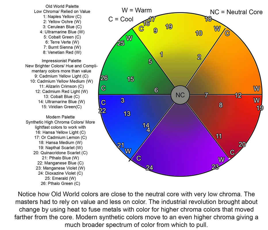
Color palettes have shifted and changed over the centuries and even the last few decades as color technology changes. The old masters had very few colors from which to choose, and those colors were made from earth or minerals ground to dust. Most were fairly low chroma colors so the masters had to rely on VALUE more than color to make a painting come together. Think of the great Rembrandt; arguably the greatest artist to ever live. Look at his paintings and his color selection. Muted earth tones predominate his work, with great splashes of light to create his magical effect. As time moved on and the industrial revolution of the 18th and 19th centuries exploded, many new colors were invented through the use of heat and metals. Think of Monet and Renoir with their jewel tone canvases that sparkle with light and color. These new, brighter colors led to breakthroughs for artists to shift from traditional techniques and blaze new trails of color. Enter the 20th century and the scientific laboratories and increased communication. Synthetic colors were created with Chroma levels never seen before. Warhol had new toys to play with! Today's palette can be whatever you want it to be, from traditional, to impressionistic, to modern, or a combination of any or all of them. Consider this next illustration to see how the palettes have changed and where their chroma levels appear within the color wheel.
... Back to the color wheel for a moment. The wheel is broken down into six sections, Yellow, Orange, Red, Violet, Blue and Green. Each of those sections is known as the color family, or Hue. At the outer edge of the circle is the highest chroma area, or the area with the brightest, most intense colors. Near the center of the wheel is the neutral core or the area with the lowest Chroma colors. Knowing a colors "Chroma" is important in knowing what to mix to achieve your color. Complimentary colors can be added to a color to lower it's chroma. Anytime two colors are mixed their chroma is lowered. Complimentary colors are the colors located on the opposite side of the wheel from any color. Red's complimentary is Green. Blue's is Orange, and so forth. Adding a complimentary color will shift any color toward the neutral core.
The two-dimensional color wheel pretty much deals in Hue and Chroma only. But what about Value? It's not there, right? As a color gets "lighter" it's value is considered "higher". As it gets "darker" it's value is "lower". Notice the core going through the center of the wheel. White is at the top (higher value) and black is at the bottom (lower value). In between is a myriad of grays. Let's break those down into three values of gray; light, medium, and dark. Medium gray is located where the wheel meets the core. Light gray is midway between there and white, and dark is midway between there and black. Those grays plus black and white will be important when mixing our colors. More on how to use gray for color mixing in a moment.
Temperature: Each color family has an inherent temperature. Yellow, Orange and Red are considered WARM. Violet, Blue and Green are considered Cool. (Think of Red Hot Fire and Cool Blue Water). However, within those color families each hue has an individual temperature "Tendency". Notice around the edge of the wheel, there are "W"s and "C"s representing cool and warm. The Yellow wedge is cooler toward the green side and warmer toward the orange side. Blue is cooler toward the green or yellow side and warmer toward the violet or red side. Two warms meet at Orange and Red, and two cools meet at Blue and Green. These are known as the Hot Spot and Cold Spot. Learning a colors temperature can go a long way in helping you mix what you are looking for. I have indicated colors around the edges with their temperatures, along with their home palette: Old World, Impressionist, Modern. (more on palette selection later as well...stay with me).
So what have we discussed so far?
1: Hue ; the actual color or mass tone Red, Orange, Yellow, Green, Blue, Violet. (ROY, Gee, BiV)
2: Temperature; a colors tendency to be warm or cool within it's hue family
3: Chroma; a colors intensity, or it's location in relation to the outer edge of the wheel and the neutral gray core.
4: Value; a dark or light a color is in relation to black and white.
Let's call those four items a color's "Traits". Determining those four elements of any color will help you nail down what to mix to achieve nearly any color you can see. Where do we begin? Let's begin by isolating the color we want to duplicate. Often recognizing a colors trait is difficult when it is surrounded by other colors. One neat trick I use is to punch holes in a white card (such as the back of a business card) and hold that hole over the color I want to duplicate. You can do that by laying it on a photograph you are using as reference, or holding the card out in front of you with one eye closed and moving the card closer or further from your open eye as necessary to isolate the color. What is its value in relation to white? Is it very dark, or is it close to the white? Doing this will make it easier to know where on the neutral core to place your color. Now, what Hue is it? Narrow it down to the simple six on the color wheel. Where within the color slice is it located; the warm side or the cool side? Now determine if it is high or low chroma. Knowing those four things will lead you to your starting point. The starting point will be one of the colors you have on your palette. Let's go into palette selection for a moment.
Color palettes have shifted and changed over the centuries and even the last few decades as color technology changes. The old masters had very few colors from which to choose, and those colors were made from earth or minerals ground to dust. Most were fairly low chroma colors so the masters had to rely on VALUE more than color to make a painting come together. Think of the great Rembrandt; arguably the greatest artist to ever live. Look at his paintings and his color selection. Muted earth tones predominate his work, with great splashes of light to create his magical effect. As time moved on and the industrial revolution of the 18th and 19th centuries exploded, many new colors were invented through the use of heat and metals. Think of Monet and Renoir with their jewel tone canvases that sparkle with light and color. These new, brighter colors led to breakthroughs for artists to shift from traditional techniques and blaze new trails of color. Enter the 20th century and the scientific laboratories and increased communication. Synthetic colors were created with Chroma levels never seen before. Warhol had new toys to play with! Today's palette can be whatever you want it to be, from traditional, to impressionistic, to modern, or a combination of any or all of them. Consider this next illustration to see how the palettes have changed and where their chroma levels appear within the color wheel.
Choose your color palette to reflect a look you are trying to achieve, or for ease of mixing, or to challenge yourself. My personal color selection tends to be a mixture of all three eras. I tend to use:
Titanium/Flake White mixture 50/50
Hansa Yellow Light (cool high chroma yellow)
Cadmium Yellow Medium (warm high chroma yellow)
Yellow Ochre (warm low chroma yellow)
Cadmium Red Light (warm high chroma red/orange)
Burnt Sienna (warm low chroma orange)
Winsor Newton Permanent Carmine (cool low chroma red)
Ultramarine Blue (warm mid chroma blue)
Phthalo Blue (cool high chroma blue)
Pthalo Green (cool high chroma green)
(alternate) Prussian Green (Cool, mid chroma dark green)
Sap Green Permanent (warm middle chroma green)
Terre Verte (warm low chroma green for grisaille painting)
Burnt Umber
Two Chromatic Blacks ( One cool mix of 2pt Winsor Newton Permanent Carmine/1pt Pthalo green, Another warm mix using Ultramarine Blue and either Burnt Sienna or Umber )
Also on my palette I have several piles of gray mixtures. Using the Two Chromatic black mixtures I divide each pile in half and add cool white to the cool black and warm white to the warm black. Then I divide each of those piles in half and add white again making a lighter gray. I do that one more time to make yet another even lighter pile of gray.
Titanium/Flake White mixture 50/50
- I divide that pile in half and add a speck of Ultramarine Blue to one pile for a cool white, and a tiny (very tiny) speck of Cad Red Light for a warm white.
Hansa Yellow Light (cool high chroma yellow)
Cadmium Yellow Medium (warm high chroma yellow)
Yellow Ochre (warm low chroma yellow)
Cadmium Red Light (warm high chroma red/orange)
Burnt Sienna (warm low chroma orange)
Winsor Newton Permanent Carmine (cool low chroma red)
Ultramarine Blue (warm mid chroma blue)
Phthalo Blue (cool high chroma blue)
Pthalo Green (cool high chroma green)
(alternate) Prussian Green (Cool, mid chroma dark green)
Sap Green Permanent (warm middle chroma green)
Terre Verte (warm low chroma green for grisaille painting)
Burnt Umber
Two Chromatic Blacks ( One cool mix of 2pt Winsor Newton Permanent Carmine/1pt Pthalo green, Another warm mix using Ultramarine Blue and either Burnt Sienna or Umber )
Also on my palette I have several piles of gray mixtures. Using the Two Chromatic black mixtures I divide each pile in half and add cool white to the cool black and warm white to the warm black. Then I divide each of those piles in half and add white again making a lighter gray. I do that one more time to make yet another even lighter pile of gray.
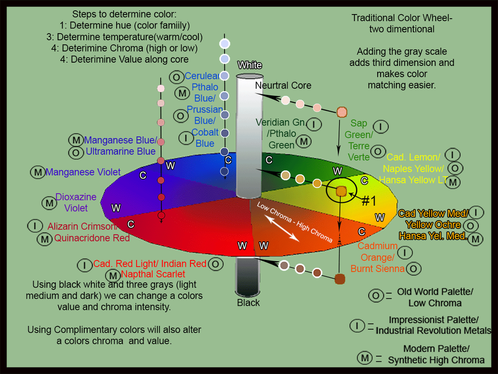
Let's go back to the 3D color space wheel for a moment and see how to mix the sample colors shown. Let's choose the light orange sample just above the orange wedge (marked with #1). We can see that the arrow points down to an area near the cool end and slightly away from the edge of high chroma. Depending on the color you have on your palette for that hue, that is where you will start. Let's use Cadmium Orange. We need to drop the chroma a little. The easiest way is to add a little of the complimentary color to our main color. The color on the opposite side of the wheel is Manganese Blue or Ultramarine Blue. We won't need much to shift the chroma in just a little, and you can always add more; so add a touch of blue to the orange to shift it. Now let's raise the value. We want to shift up somewhere above center so let's add light warm gray. Mix with a palette knife just until the color is mixed. Don't over mix. Test the color against what you want to match and adjust from there. Does it need more gray? Yellow? Red? More Blue? It SHOULD be close and should only need a little adjustment, if any.
What if we had used Burnt Sienna? It is already low chroma and we need to shift slightly toward higher chroma. Adding Cadmium Yellow Medium, or whatever warm yellow is on your palette should shift it. Then add the light warm gray to raise the value. Easy Peasy, right? Well, it does take some practice!
THE COLOR MIXING TRAIL: Mix colors in a practice session! Follow this simple path to get your color. Place your colors of choice around the edge of your palette, with Whites to the left and Blacks to the right (or visa/versa, and Grays along the bottom. Find colors in a photo or the room or nature and try to replicate them. Knowing where to start is key. I start by determining the Hue. That lets me know the family and using any of the palettes suggested above I usually have two choices. Next I determine Temperature. That lets me know which of the two colors on my palette to start with. Once I know the color family I determine if it is high or low chroma. Do I need to add a higher chroma color or the complimentary color? Next determine the value from dark to light. Once you know which gray (or black or white) to add then you are almost done. Test by holding up the palette knife of color next to or in front of what you are trying to replicate. If it melts into it visually then you've nailed it. If not, you will know which way to go.
Practice makes perfect, and even this method isn't fool proof or the only way of achieving a certain color. But, it's a great place to start! I hope this has helped you a little to understand color mixing and will make your art career more enjoyable. Please let me know your feedback and suggestions to make this art-tickle better!